Home / CalMatters

Building a scalable design system and defining brand identity for California's leading nonprofit news organization

Role
Product Designer
Timeline
2022—2024
Overview
As the sole designer at CalMatters, I worked on all design needs including UX, information architecture, social media, and more. I spent a significant amount of time developing a core visual language and design system that could scale over time while standardizing our brand foundation. My top priority when designing for news was maintaining our robust editorial credibility while also advocating for the user and delivering an accessible and engaging reading experience.
CalMatters design system
Foundations

Color

The CalMatters color system is built on a base of aqua and gold, which are derived from our California + charity ribbon logomark. The vibrant color scheme is inspired by California's sunshine and beaches; its tone is meant to be positive and hopeful, symbolizing continued better tomorrows.

System Proportions
aqua-500
#075E73
Primary
aqua-600
#074150
Hover
grey-600
#212121
Headings
grey-500
#3D3D3D
Body
gold-500
#FF9E16
Accent
aqua-100
#F3F9FA
Light Surface
grey-010
#F5F5F5
Page Surface
grey-100
#EEEEEE
Hover State
aqua-400
#0A819F
Interactive
gold-300
#FAE6B2
Gold Tint
Primary
1.1:1
aqua-100
#F3F9FA
Light backgrounds, subtle highlights
1.2:1
aqua-200
#E2F0F3
Hover states for light surfaces
1.6:1
aqua-300
#A5D4E4
Accent backgrounds, badges
AA4.5:1
aqua-400
#0A819F
Icons, borders, dividers
AAA7.3:1
aqua-500
#075E73
Primary buttons, links, active states
AAA11.2:1
aqua-600
#074150
Hover states, pressed buttons
Data Visualization
1.0:1
desert-100
#FFFBD4
Background fills
1.4:1
desert-200
#FED98E
Light series
2.1:1
desert-300
#FE9929
Mid-range
3.8:1
desert-400
#D95F0E
Strong emphasis
AAA7.4:1
desert-500
#993404
Max intensity
California Wildfire Risk Index
Monthly average intensity · Normalized 0–100
Jan
Feb
Mar
Apr
May
Jun
Jul
Aug
Sep
Oct
Nov
Dec
Desert Regions
Southern CA
Central Valley
Bay Area
Sierra Nevada
North Coast
Low
HighCAL FIRE · Illustrative data
Semantic & Neutral
Error
#DA1E28
error-100
#FFF1F1
error-000
Error state
Warning
#B45309
warning-100
#FEF3D8
warning-000
Warning state
Success
#15803D
success-100
#DEFBE6
success-000
Success state
Info
#0043CE
info-100
#EDF5FF
info-000
Info state
Contrast Checker

The quick brown fox jumps over the lazy dog

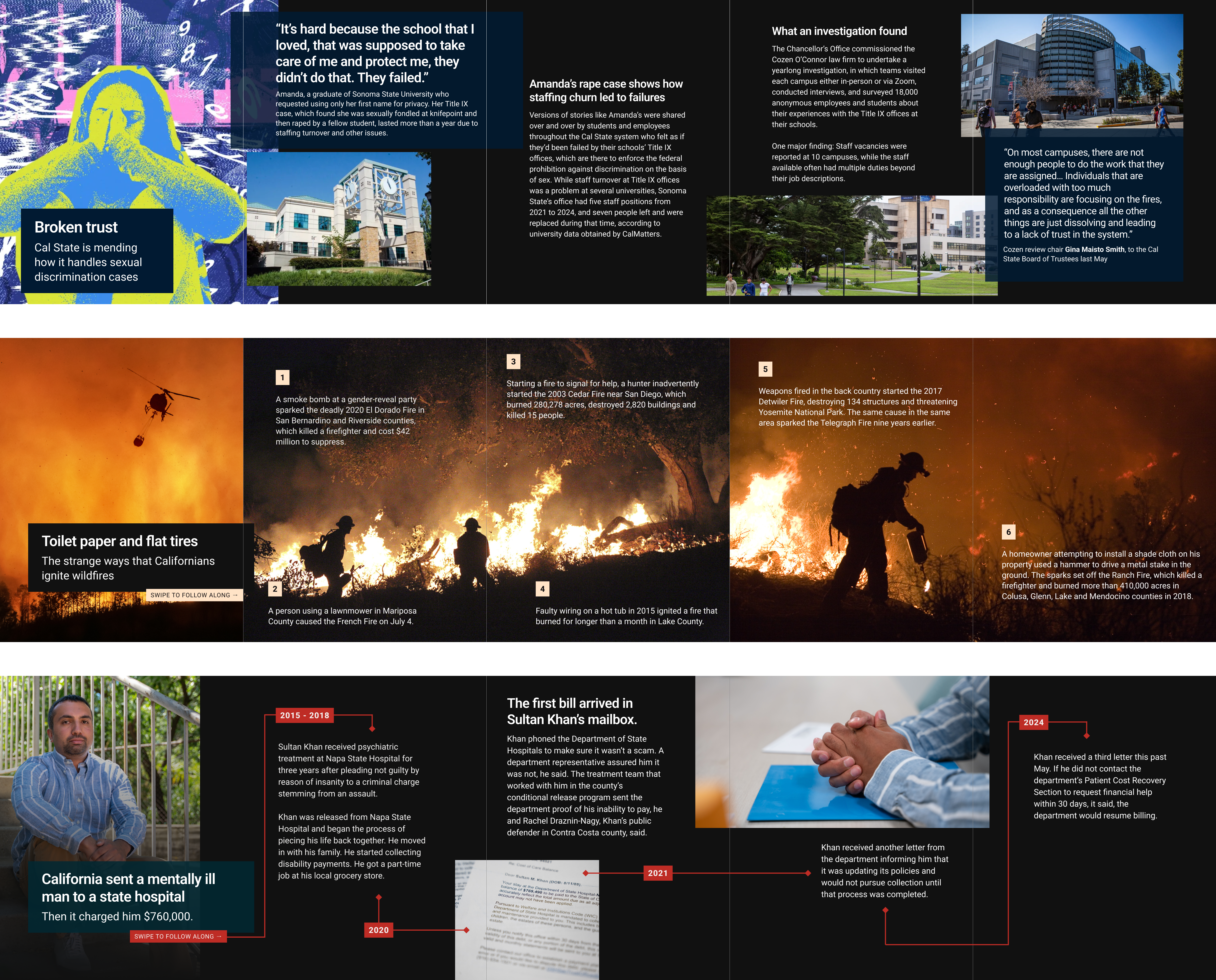
Updated reporting includes budget revisions, committee notes, and source-linked corrections.

Text
Background
7.35:1
Small AA
Small AAA
Large AA
Large AAA
Usage Guidelines
Semantic notifications
semantic clarity
DO
You're subscribed to WhatMatters. Your first edition arrives tomorrow morning.
We couldn't save this article. Sign in to add stories to your reading list.
This article was last updated Nov 14, 2025. Some figures have been corrected.
Use appropriate semantic colors
Green for confirmations, red for errors, blue for informational notices about site interactions.
DON'T
You're subscribed to WhatMatters. Your first edition arrives tomorrow morning.
We couldn't save this article. Sign in to add stories to your reading list.
This article was last updated Nov 14, 2025. Some figures have been corrected.
Don't use misleading color associations
Red for confirmations and green for errors inverts user expectations and creates confusion.
Category labels
editorial neutrality
DO
BudgetHealthcareTransportation
Use neutral colors for categories
Neutral grays and subtle tones keep focus on content without implying bias or emotion.
DON'T
BudgetHealthcareTransportation
Don't use strong colors for neutral content
Bright, saturated colors suggest importance or emotion where none exists, creating bias.

Typography

Typography is set in Source Sans Pro for legibility in dense policy reporting. The scale defines eleven tokens across five layers: display, headline, reading, annotation, and label.

Weights
200 · ExtraLight
California Housing Crisis
300 · Light
California Housing Crisis
400 · Regular
California Housing Crisis
In use
600 · SemiBold
California Housing Crisis
In use
700 · Bold
California Housing Crisis
In use
900 · Black
California Housing Crisis
Scale
Display--cm-display
40px · 700 · lh 1.08 · ls -0.02em
California's Water Future
Feature stories, homepage hero, in-depth analysis landers
Headline LG--cm-headline-lg
28px · 600 · lh 1.18 · ls -0.01em
State lawmakers approve landmark budget deal
Primary article headlines, section fronts
Headline MD--cm-headline-md
20px · 600 · lh 1.28
New conservation targets set for 2030
Secondary headlines, card titles, related stories
Headline SM--cm-headline-sm
16px · 600 · lh 1.35
Drought response measures take effect statewide
Tertiary headlines, sidebar modules, inline references
Standfirst--cm-standfirst
16px · 400 · lh 1.62
State officials announced a framework requiring cities and counties to reduce water consumption by 15 percent before 2030, citing record drought conditions.
Article deck: the paragraph immediately below the headline
Body--cm-body
15px · 400 · lh 1.72
The proposal, backed by the governor's office and conservation groups, would require water agencies to submit detailed plans by June. Officials said targets are achievable.
All article prose
Body SM--cm-body-sm
13px · 400 · lh 1.55
Reporting was supported by a grant from the California Health Care Foundation. CalMatters maintains full editorial independence.
Image captions, footnotes, secondary body copy
Byline--cm-byline
11.5px · 400 · lh 1.4 · ls 0.01em
By Sarah Chen and Marcus Webb
Author attribution, placed between the standfirst and article body
Meta--cm-meta
11px · 400 · lh 1.4 · ls 0.01em
November 16, 2025 · 6 min read · Sacramento
Timestamps, read time, location: always secondary to byline
Overline--cm-overline
10px · 600 · lh 1.2 · ls 0.14em
Climate & Environment
Category labels above headlines: always uppercase, always a single semantic color
Label--cm-label
10.5px · 600 · lh 1.2 · ls 0.07em
Subscribe to newsletter
Buttons, filter tags, navigation items
Roles
Kicker / Overline
Precedes the headline. Marks category or story type. Always uppercase, always a single semantic accent color.
--cm-overline
10px / 600 / ls 0.14em
Display Headline
Reserved for the most important story on the page: homepage feature, long-form lander, data investigation.
--cm-display
40px / 700 / lh 1.08
Primary Headline
Used for most article headlines and section-front lead stories.
--cm-headline-lg
28px / 600 / lh 1.18
Secondary Headline
Cards, related article modules, inline list headlines.
--cm-headline-md
20px / 600 / lh 1.28
Tertiary Headline
Sidebar modules, newsletter digests, highly compressed layouts.
--cm-headline-sm
16px / 600 / lh 1.35
Standfirst / Deck
The paragraph immediately below the headline. Longer line-length than body. Never bold.
--cm-standfirst
16px / 400 / lh 1.62
Body Text
All article prose. Line length constrained to 65-75 characters per line.
--cm-body
15px / 400 / lh 1.72
Image Caption
Brief description beneath photos, charts, and maps.
--cm-body-sm
13px / 400 / lh 1.55
Byline
Author attribution, placed between the standfirst and the body.
--cm-byline
11.5px / 400 / ls 0.01em
Timestamp & Meta
Publication date, reading time, and location. Always secondary to byline.
--cm-meta
11px / 400 / ls 0.01em
UI Label
Button copy, filter tags, navigation labels. Uppercase in most contexts.
--cm-label
10.5px / 600 / ls 0.07em
Specimens
Climate & Environment
California's Water Future
State officials announced a framework requiring cities and counties to reduce water consumption by 15 percent before 2030, citing record drought conditions and mounting pressure from advocates.
By Sarah Chen and Marcus WebbNovember 16, 2025 · 6 min read
Guidelines
01
Use weight to signal hierarchy, not size alone
The scale has intentional overlap: standfirst (16px / 400) and Headline SM (16px / 600) share the same size but differ in weight. This lets the system compress into constrained layouts without losing hierarchy.
--cm-standfirst--cm-headline-sm
02
Overlines are always uppercase and single-color
Use one approved accent color per overline. Never use neutral gray and never stack multiple colors. The role is categorization, not decoration.
--cm-overline
03
Constrain body text to 65-75 characters per line
At --cm-body (15px), a container of roughly 560-600px produces the optimal reading column. Going wider strains tracking; going narrower fragments ideas across too many lines.
--cm-body
04
Never use more than two weights in a single component
A card with an overline, headline, and timestamp only needs 600 and 400. Adding a third weight adds noise without hierarchy. Reserve Bold (700) for the display token only.
--cm-display--cm-headline-lg

Buttons

Buttons are the primary interactive surface in the editorial UI. Six variants span action weight and surface context, with a reserved gold token for donation CTAs.

Variants
Primary
Highest-priority action per view. Newsletter signup, key navigation CTAs.
--cm-btn-primary
Secondary
Supporting action alongside a primary. Read more, Learn more, View all.
--cm-btn-secondary
Ghost
Low-emphasis inline action. Share, Print, topic filters. Requires clear surrounding context.
--cm-btn-ghost
Translucent Aqua
Action placed on aqua-tinted editorial surfaces. Maintains brand connection without full opacity.
--cm-btn-translucent-aqua
Translucent Purple
Action within purple-tinted surfaces such as opinion or analysis section headers.
--cm-btn-translucent-purple
Donation (Gold)
RESERVED
Used exclusively for donation CTAs. Gold reinforces CalMatters' nonprofit identity and distinguishes giving from product actions.
--cm-btn-donation
Behavior
Default
Hover
Focus
Disabled
Guidelines
01
One primary per context
A page, card, or modal should contain exactly one primary button. When two actions need equal weight, use secondary + primary. Multiple primaries dilute hierarchy and split attention.
editorial clarity
02
Labels are sentence-case verbs
Lead with a verb that names the outcome: Sign up, Share story, View all. Avoid vague labels like Click here. Never use ALL CAPS in button copy.
plain language
03
Gold is reserved for donations
The gold/amber token is used exclusively for donation CTAs. Its visual warmth distinguishes the act of giving from standard product actions, reinforcing CalMatters' nonprofit identity.
token integritynonprofit identity
04
Match variant to surface context
Translucent variants exist for tinted editorial surfaces where a solid button would compete with the background. Never use a translucent variant on a white surface, where it loses contrast and looks washed out.
contextual design
Brand

Social Media

Social templates carry our visual language into feed and story formats, adapting the editorial design system for Instagram, newsletter, and campaign contexts.

CalMatters social story gridCalMatters editorial social features

Donation

CalMatters is free to read and entirely reader-supported. Donation design must help generate revenue without undermining the editorial credibility that earns that support. Our visual system handles this through isolation, with a reserved color palette and contained surfaces.

Color Use
--cm-donation-fillButton background for all donation actions.
--cm-donation-hoverButton hover and active state.
--cm-donation-surfaceBackground tint for donation containers.
--cm-donation-textAll copy on donation surfaces.
DO
Support independent journalism
CalMatters is free because readers like you give.
Our nonprofit newsroom depends on reader generosity to stay independent.
Gold inside a bounded donation module
The tinted surface contains the ask. Gold reads as a donation action with no ambiguity.
DON'T
Housing
Assembly passes rent relief package amid budget uncertainty
Nov 16 · 4 min read
Gold on standard editorial actions
When gold signals navigation and sharing, it loses its meaning. Readers can no longer tell what the color is asking of them.
Principles
01
Gold is reserved for giving, not navigation
No other interactive element in the product uses the gold token. This exclusivity makes donation CTAs immediately recognizable across every surface.
signal integrity
02
Donation surfaces are visually bounded
Donation modules always live in a distinct container like cards, banners, and the footer. Gold never bleeds into editorial content.
visual isolationeditorial separation
03
Contrast over warmth on text
All copy on donation surfaces uses #1A1A1A, near-black for maximum readability.
legibility first
04
Placement reflects editorial respect
Donation asks appear after a reader has engaged with content, signaling our priority with the reading experience first.
reader-firstearned attention